Sunday, February 5, 2023

UC Davis: SQL for Data Science - Profiling and Analyzing the Yelp Dataset

Whats is Yelp? It aims to provide a one-stop platform for local businesses. Like other social media, it creates community. And that community discovers, transacts, and reviews local businesses around them.

For this post we will use Yelp dataset and will formulate ideas for analysis.

First, we need to explore the dataset. Below is the structure data in table form.
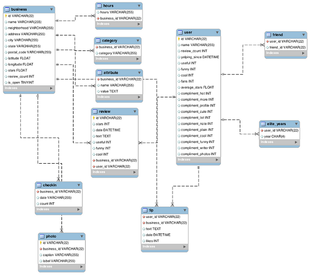
The Yelp Dataset
The Yelp Dataset


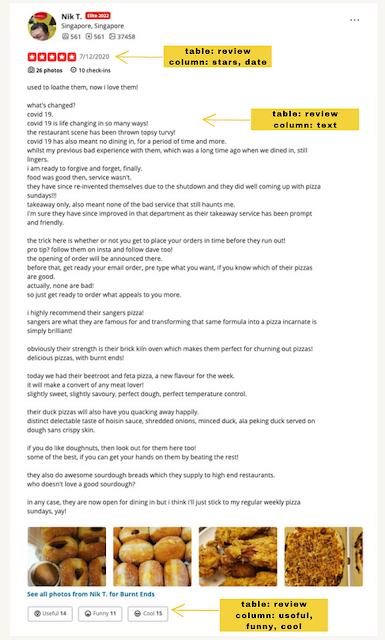
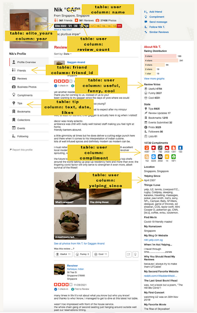
And for me to understand the above data and the entirety of its contents, I have visited the YELP website and marked the table names and column names against its pages.
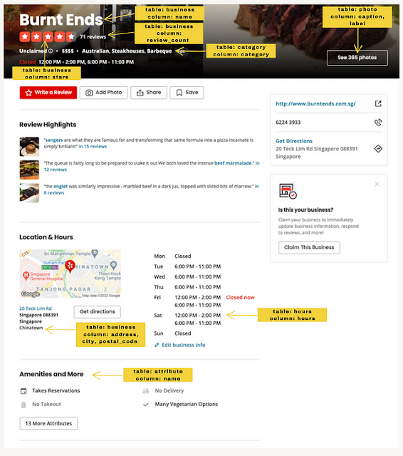
The Yelp Dataset - Business

The Yelp Dataset - Review

The Yelp Dataset - User Page


Armed with understanding, profiling and establishing relationship among multiple tables, you can now look onto subjects that can be useful for different stakeholders.

Some of the business questions lingered on my mind upon seeing the above data were:
  • What cities could be the best choice in setting up a business?
  • Are there weight on the reviews coming from elite year users?
  • What are the main words used in text reviews for sentiment analysis?
  • Finding the effect of review_count and check-in on the life of a business.

I focused on the latter due to the limitations of SQLite.
SELECT business.name
, business.stars
, business.review_count
, business.is_open
, SUM(checkin.count)
FROM business INNER JOIN checkin ON business.id =checkin.business_id
GROUP BY business.name
ORDER BY SUM(checkin.count) DESC


Two (2) tables were needed to get the answer for the above analysis. I used INNER JOIN to avoid getting the ‘None’ value.

The below selected data will prove that even a company received only 1 star it is still open for business. That businesses that received highest checkin count do not necessarily have 5 stars and so on. Thus, this data means that there is no direct correlation on stars, review_count and checkin.

It would be good for YELP to indicate the current population for the neighbourhood on that business.

The Yelp Dataset — Correlation of Review Count, Checkin, and Stars


That’s all for now! Be curious y’all! Don’t forget to click the clap button! *wink-wink*

Saturday, February 4, 2023

Exploring Supply Chain Dataset

As I have written on my past posts, supply chain / logistics companies are one of the wells of data and most of them are not aware of it.

For this post, I will scratch some parts of data cleaning and apply some descriptive analysis on the data I have found in Kaggle.

Here are the usual steps I am taking in cleaning the data.

As practised, these are the main libraries that I usually use in Python and let’s import these now.
import pandas as pd
import numpy as np
import matplotlib.pyplot as plt
import seaborn as sns

Now, let’s call in my downloaded dataset titled: DataCoSupplyChainDataset.csv. It is very important to know too the description of every column name we have in the csv and it is very helpful that we found a dataset that also has this feature.
df = pd.read_csv('DataCoSupplyChainDataset.csv')
info = pd.read_csv('DescriptionDataCoSupplyChain.csv')
pd.set_option('max_colwidth', 1)
info


Now let’s explore our data.
pd.set_option('display.max_columns', None)
df.head()
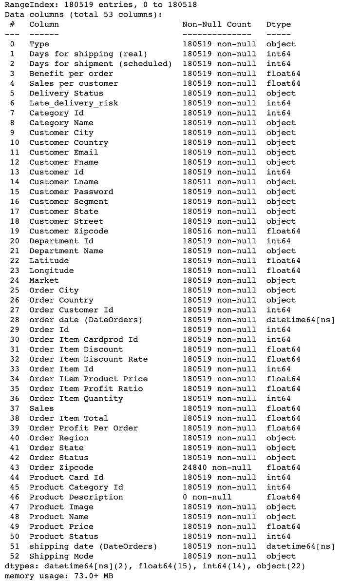
df.info()
https://github.com/WilmaLapuz/Portfolio/blob/main/SUPPLYCHAIN.ipynb


Have you noticed what is wrong on the datatype on above column? Shipping date (DateOrders) is in object. Let’s convert it to a proper data type.
df['shipping date (DateOrders)'] = pd.to_datetime(df['shipping date (DateOrders)'], format='%m/%d/%Y %H:%M')
df['order date (DateOrders)'] = pd.to_datetime(df['shipping date (DateOrders)'], format='%m/%d/%Y %H:%M')
df.info()


Let’s further simplify this data.

If you will check the values on each row, you will find that there are somewhat duplicates of columns. To see what other columns we need to drop, let’s check what columns consist equal values.
df['Customer Id'].equals(df['Order Customer Id'])
df['Benefit per order'].equals(df['Order Profit Per Order'])
df['Order Item Cardprod Id'].equals(df['Product Card Id'])

Drop all sensitive and duplicate/redundant variables to clean our data.

df.drop([
'Benefit per order',
'Customer Email',
'Customer Password',
'Product Image',
'Order Zipcode',
'Product Description',
'Order Item Cardprod Id',
'Order Customer Id'
], axis = True, inplace = True)

df.head()


These are the few variables that caught my eyes:
  1. Type
  2. Late_delivery_risk
  3. Customer State
  4. Order Country
  5. Order Region
  6. Order Status
  7. Product Name
  8. Shipping Mode

Using the above list of variables and describe function, here are the questions that may a supply chain want to be known.

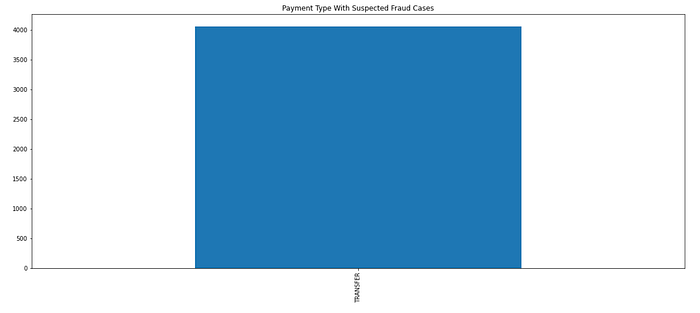
1. What type of payment that will be likely to be fraud? From what country? What product?
fraud=df[df['Order Status']=='SUSPECTED_FRAUD']
fraud_payment=fraud['Type'].value_counts().nlargest().plot.bar(figsize=(20,8), title="Payment Type With Suspected Fraud Cases")
fraud_ordercountry=fraud['Order Country'].value_counts().nlargest().sort_values(ascending=False).plot.bar(figsize=(20,8), title="Top 5 Countries With Suspected Fraud Case")fraud_ordercountry=fraud['Product Name'].value_counts().nlargest().sort_values(ascending=True).plot.barh(figsize=(20,8), title="Top 5 Products With Suspected Fraud Case"
https://github.com/WilmaLapuz/Portfolio/blob/main/SUPPLYCHAIN.ipynb

2. What year has the most oder shipment from the state of Illinois?
df['year'] = pd.DatetimeIndex(df['order date (DateOrders)']).year
IL=df[df['Customer State']=='IL']
IL['year'].value_counts().plot.bar(figsize=(20,8), title="Illinois Record of Shipments")

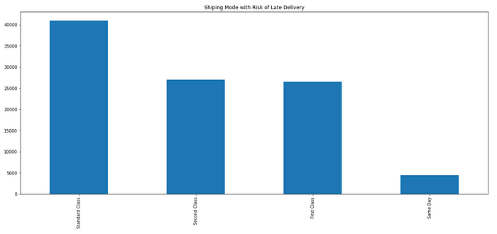
3. What shipping mode and region that has a higher delivery risk?
LATE=df[df['Delivery Status'] == 'Late delivery']
LATE['Shipping Mode'].value_counts().plot.bar(figsize=(20,8), title="Shiping Mode with Risk of Late Delivery")
https://github.com/WilmaLapuz/Portfolio/blob/main/SUPPLYCHAIN.ipynb

This is only the start of many things what we can uncover using this supply chain dataset. I will do my best to use this dataset for my other upcoming projects.

Friday, February 3, 2023

My First TIBCO SPOTFIRE Dashboard

I think I started to follow She Loves Data’s Facebook page when I have this curiosity in blockchain world. Basing on their non-profit social enterprise name, of course they were formed to uplift women and be a contributor in the world of data/technology.

So why I am blogging about She Loves Data? 2nd of July 2021, I signed up for one of their free workshops titled SheLovesData : Dashboard Foundations. The workshop has four modules and runs into a month of session. As what I have said on my previous posts, I am a newbie in this world of data and that is the reason I am so enthusiastic in learning and picking-up some of the brains of experts. With a partnership with TIBCO and SMU (Singapore Management University) the learners received a free 1 year-license to TIBCO Spotfire® subscription worth US$1250.

Oh, wow! TIBCO! If you are an F1 fan you will definitely know that Mercedes-AMG Petronas uses TIBCO for analysing their data.

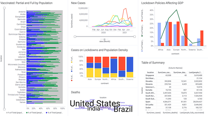
My First TIBCO SPOTFIRE Dashboard
Dashboard for Module 4: #COVIDStory6 : https://bit.ly/3adbkU0


Let’s dig in to what I have learned:
Module 1 : The first week, of course is still a friendly week. Justin (our instructor) walked us through with the dashboard. We were immediately familiarised with Spotfire’s markings and filters. Basically, we explored the Spotfire dashboard as an end-user. It is only get-to-know week and our first assignment is to upload a photo card and state 2 facts and a lie about us.

Module 2: The agenda for that week is about Business and Analytical Questions and what are the uses of different charts. TICBO helps with Descriptive Analytics.

Module 3: Cleaning and visualisation. DATA: Deduce, Acquire, Tidy, Augment — The Development Data Process. That week’s exam is pretty challenging.

Module 4: We were taught how to build interactivity, bookmarks and stories in the dashboard. Of course, this is the finals and we were given 2 weeks to complete our last homework for this workshop.

The workshop will tickle your brain to build a great dashboard with simplicity and accuracy. Based on my experience, She Loves Data workshop truly is worth the time and TIBCO Spotfire is quite an intuitive tool even for newbies.
What’s next?

Since I have the free Spotfire for a year, I will use it and be part of my portfolio :)

Looking forward on She Loves Data next workshop for specialists! Yey!

Get this gadget at facebook popup like box