There’s a lot of FREE webinars/training online and FREE tools to explore and that is the main reason why a huge number of people were lost and didn’t know where to begin their DATA journey. I am a bit picky now with training/webinars. Let us just say that there are numerous cr*p contents that will waste your time. Some free training is after your data, you are just a number to flaunt to their partners or sponsors.
Well, Power BI Essentials got me hooked! I am glued to our screen for more than three hours. Mr. Abraham Avila Jr was the trainer for that day and he taught us from installing Microsoft Power BI up to building a dashboard solution for the HR team.
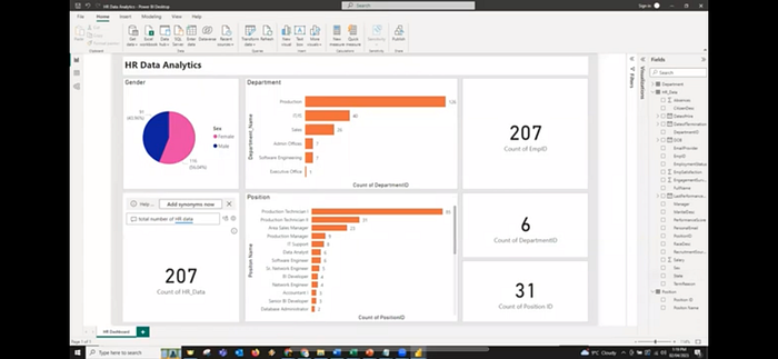
After the training this is the dashboard created by Sir Abs:
 |
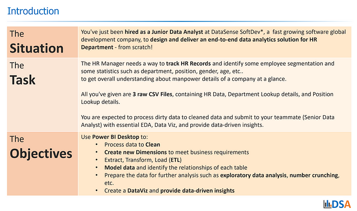
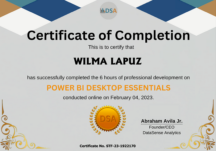
For us to receive a certificate we need to submit an enhanced dashboard to fulfil further the task and objectives given below:
 |
For Apple users like me, you can access the free Power BI tool through VMware.
or Apple users like me, you can access the free Power BI tool through VMware.
Dataset can be found here: Power BI Desktop Essentials
Data Cleaning:
Always start with the first column.
— LastName: Trimmed, Capitalize Each Word
— FirstName: Trimmed, Capitalize Each Word
— MiddleInitial: Trimmed, Capitalize Each Word
— EmployeeID: Changed to Text
— PositionID / DepartmentID: No changes
— Manager: No Changes
— DateofHire: Changed to Date Format
— Salary: Changed to currency
— DOB: Changed to Date Format
Data Modeling:
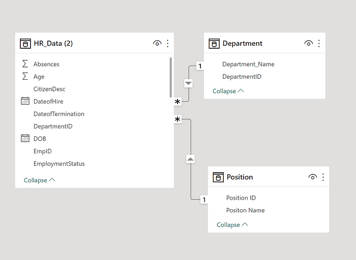
Power BI is intelligent enough to know the primary keys in each table you uploaded. Here the primary key for the Department Table that connects HR_Data is DepartmentID and Position to HR_Data is PositionID.
Just always double check those connections.
 |
Data Manipulation:
— Full Name: Added new column to merge LastName, FirstName, MiddleInitial and dropping the three separate columns
— Age and Employee RetentionAdded New column using age menu in the Power Query Editor
Data Analysis:
We use a high level dashboard that will identify employee segmentation required by the HR Manager.
Filters were created for users to drill down data as per their need.
— Hire Date
— Department
— Manager
— Employment Status
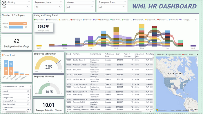 |
- We created a number of employees and marital status segmented by gender.
- We used median age instead of average because of the widespread age in our data.
- Created a ribbon chart that will show not only the trend of hiring but also the average salary for each position.
- Table will magnify the best recruitment source for HR
- Meters will give a color coded goal for employees average satisfaction and absences.
- The Employee Table will give a high level overview for each person.
- Mapping out the employees location will be useful in determining where to publish vacancies for a certain department/position.
Have I told you that this is my first Power BI dashboard? If you found this useful, kindly clap/like my post or you have some suggestions for me to enhance my data viz, please comment on this post.
I have read an online debate regarding free courses vs paid bootcamps. Some will definitely standstill in their opinion that you can’t be a data analyst by just staring at your screen and answering a few multiple choice exams. But I have seen SPARTA and Google Graduates who are now working full time in their dream jobs. Well, in the end, it is not the course, it is not your professors in your school… IT IS YOU who will determine your next step..your future in your OWN DATA JOURNEY!
 |

No comments:
Post a Comment